Why Choosing the Right Number of Clusters is Crucial
Trying to fit a square peg into a round hole. That’s what happens when you choose the wrong number of clusters in K-Means clustering. It’s like forcing data into groups that don’t really exist—or worse, missing important patterns.
Getting ‘K’ right means you can accurately uncover the natural structure of your data. But pick the wrong number, and your model is basically guessing. So, it’s not just about clustering—it’s about meaningful clustering.
Your goal is to balance between underfitting and overfitting, avoiding both extremes. Too few clusters? You miss key insights. Too many? You risk fragmenting the data unnecessarily. It’s a balancing act—and a tricky one at that!
What is K-Means Clustering? A Quick Overview
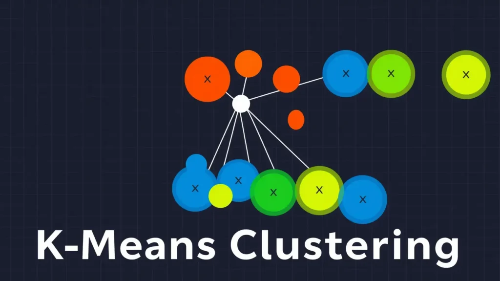
Before diving into methods, let’s clarify what we’re working with. K-Means clustering is a method for grouping data into distinct clusters based on their similarities. The algorithm assigns each data point to the nearest cluster center, aiming to minimize the distance within each group. The catch? You have to decide how many clusters (K) to use before running the algorithm.
The term “means” refers to the centroid of the cluster, or the center around which the data points are gathered. Each data point is assigned to the cluster whose mean it is closest to, like people finding their ideal social circle. But determining ‘K’ is the hard part.
How ‘K’ Impacts Your Data Segmentation
Choosing the right number of clusters is like deciding how many teams to split your data into. If you pick too few clusters, your data groups will be too broad, missing crucial differences between them. Think of it like blending too many colors—you end up with a dull brown mess instead of distinct hues.
On the flip side, if you choose too many clusters, you might find patterns that don’t actually exist. In this case, you’re splitting up groups that should stay together. Too many teams, not enough teamwork. Each additional cluster makes it harder to understand the overall picture, diluting the insights.
The right value for ‘K’ ensures your clusters are meaningful, separating data points that are genuinely different while keeping similar ones together.
The Elbow Method: A Classic Approach
The Elbow Method is probably the first technique you’ll encounter when selecting the optimal number of clusters. It’s simple, visual, and surprisingly effective for many datasets. Here’s how it works: you plot the sum of squared distances from each point to its cluster center, as a function of the number of clusters.
The goal? Look for an “elbow” in the curve—a point where adding another cluster doesn’t significantly decrease the distance. At this point, adding more clusters brings diminishing returns. It’s like figuring out when more is no longer better!
That said, not every dataset has a perfect “elbow,” so while this method is helpful, it’s not a one-size-fits-all solution.
Understanding the Silhouette Score for Clustering
When the Elbow Method leaves you guessing, the Silhouette Score can step in to help. This method measures how similar each point is to its own cluster compared to other clusters. In other words, it tells you whether your points are well-matched to their cluster—or if they’d be happier in a different one.
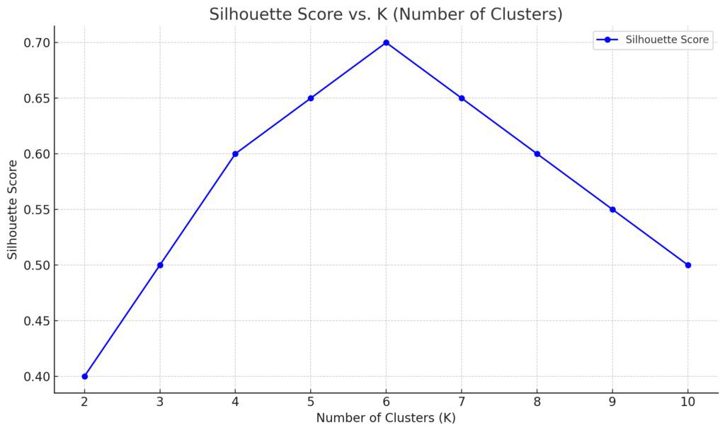
Silhouette values range from -1 to 1, where a higher score means better clustering. If your score is high, the points in each cluster are close together and well-separated from other clusters. If it’s low, your clusters may be overlapping. So, the higher the silhouette score, the better your choice of ‘K’ is!
But be warned: just like people, data isn’t always neatly separable. Sometimes, even a perfect score doesn’t mean perfect insight.
Continuing from where we left off!
The Gap Statistic: Bridging Intuition and Accuracy
If you’re looking for a more analytical approach than the Elbow Method or Silhouette Score, the Gap Statistic might be your answer. This method compares the total within-cluster variation for different values of ‘K’ with their expected values under a null reference distribution. Simply put, it tells you how well your clustering result stacks up against random data.
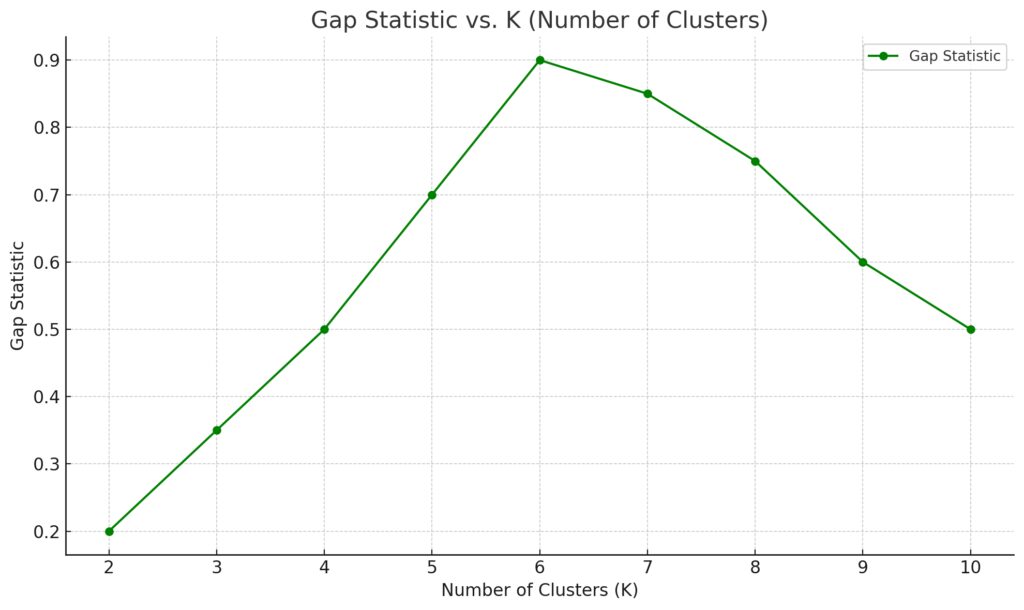
The idea is that real, meaningful clusters should create a significant gap between your data’s clustering and random noise. A larger gap suggests that the chosen number of clusters is doing a great job of capturing the true structure of your data. The best ‘K’ is the one where this gap is maximized.
While powerful, calculating the Gap Statistic can be computationally intensive. But for complex datasets, it’s often worth the extra effort, especially if you’re dealing with high-dimensional data that doesn’t present clear visual cues.
Cross-Validation for K-Means: Does it Work?
Though cross-validation is a popular method for selecting models in machine learning, it’s not commonly applied in K-Means clustering. Why? Cross-validation is typically used to assess predictive accuracy, but K-Means isn’t a predictive model—it’s unsupervised.
However, some practitioners have adapted cross-validation concepts for clustering. The idea is to evaluate how well a clustering generalizes by splitting the data, clustering one subset, and evaluating on another. While not as straightforward as in supervised learning, this approach can help validate your clustering, especially when comparing models or algorithms beyond K-Means.
Visualizing Data to Identify Natural Clusters
Sometimes, the best method for choosing ‘K’ is simply looking at your data. Visualization can provide a gut feeling about where natural groupings occur, especially in two or three-dimensional spaces. Tools like PCA (Principal Component Analysis) or t-SNE (t-distributed Stochastic Neighbor Embedding) reduce the dimensionality of your data, making it easier to spot patterns visually.
For smaller datasets, visual methods can be surprisingly effective. You can plot your data and observe where clusters naturally form. It’s an intuitive way to complement more mathematical methods, especially when your dataset isn’t too large or complex.
When More Clusters Don’t Mean Better Results
It’s tempting to assume that more clusters automatically mean better results, but that’s not always the case. Adding clusters can overfit your data, creating overly specific groupings that don’t generalize well. This can lead to misleading insights, where the algorithm finds distinctions that don’t really exist.
Imagine dividing up a group of friends: just because you can find small differences between people doesn’t mean you need to split them into a hundred different cliques! Similarly, in clustering, you want to capture the big, meaningful groups without getting lost in the minutiae.
How to Combine Multiple Methods for Robust Clustering
If you’re unsure which method to use, why not use them all? Combining different techniques can give you a more comprehensive picture of the optimal number of clusters. For example, you could start with the Elbow Method for a rough estimate, then refine your choice using the Silhouette Score and Gap Statistic.

By cross-checking these methods, you can ensure that you’re not relying too heavily on any one metric. Each approach has its strengths, and together they can provide a more robust, reliable answer for what ‘K’ should be.
This hybrid approach can save you from the pitfalls of relying on a single, imperfect method. After all, data is complex, and clustering should reflect that complexity!
Let’s continue with the next set of subheadings!
Advantages of Using Hierarchical Clustering with K-Means
Sometimes, combining methods can enhance your results. One great technique is pairing hierarchical clustering with K-Means. While K-Means requires you to specify ‘K’ upfront, hierarchical clustering doesn’t. It builds a tree of clusters that can be split at different levels, allowing you to visualize how data naturally breaks apart.
By using hierarchical clustering first, you can get a sense of how many clusters exist before committing to a fixed ‘K’. Once you have a rough idea, you can fine-tune your results with K-Means. It’s a powerful combination that lets you explore different levels of granularity before making any hard decisions.
Using Domain Knowledge to Inform ‘K’ Selection
Data science isn’t just about algorithms—it’s about context. Sometimes, the best way to determine the right number of clusters is through domain knowledge. What do you already know about the data you’re working with? If you’re clustering customer data, for example, there might be business-defined segments that make sense, such as demographics or purchasing behavior.
When choosing ‘K’, ask yourself: what makes sense in the real world? This practical perspective can often reveal natural groupings that algorithms alone might miss. It helps you balance mathematical precision with practical insight, leading to more meaningful and actionable clusters.
What Happens When You Pick the Wrong ‘K’?
Choosing the wrong ‘K’ can have serious consequences for your analysis. Too few clusters? You’ll end up lumping together data points that shouldn’t be grouped, losing valuable nuances. On the other hand, too many clusters create confusion, with the risk of splitting up data that belongs together.
In either case, poor clustering can lead to misinterpretation. For instance, if you’re segmenting customers and choose the wrong number of clusters, you could end up targeting the wrong groups, leading to ineffective marketing strategies or misguided business decisions. The wrong ‘K’ can distort your analysis and weaken your model’s impact.
Tools and Libraries for Automating K Selection
Luckily, you don’t have to calculate the optimal ‘K’ manually! Several tools and libraries can help automate this process. Python’s scikit-learn, for example, includes functions for calculating the Elbow Method and Silhouette Score, while packages like GAP-statistic handle more complex calculations.
Automated tools like Yellowbrick even provide visualizations that help you decide on the best ‘K’. These libraries make it easy to run multiple clustering methods and see how your results compare. So if you’re juggling different methods, automation can speed things up and ensure you’re not missing any crucial insights.
Avoiding Overfitting in K-Means Clustering
Overfitting happens when your model tries too hard to fit the data—this applies to K-Means as well. The more clusters you use, the more specific your model becomes, but that’s not always a good thing. Overfitting can lead to clusters that are too fine-grained, capturing random noise instead of meaningful patterns.
To avoid this, aim for simplicity. Use methods like the Elbow Method or the Gap Statistic to help you strike a balance. Remember, your goal is to find clusters that represent natural divisions in your data, not to create an artificial structure where none exists.
Real-World Examples of Optimal Cluster Selection
Seeing K-Means clustering in action helps bring theory to life. Take customer segmentation, for instance. Imagine a retail company trying to group customers based on purchasing habits. After applying K-Means, they find that a value of ‘K=3’ yields three clear groups: high spenders, occasional buyers, and bargain hunters. Each group represents a distinct behavior, and now the company can tailor marketing strategies accordingly.
In another case, a hospital might use K-Means to cluster patient data. By identifying different clusters based on age, medical history, and symptoms, they can offer more personalized care. In both examples, finding the optimal ‘K’ transformed raw data into actionable insights.
Key Takeaways for Picking the Best Number of Clusters
Choosing the right number of clusters in K-Means is a balance between science and intuition. The Elbow Method and Silhouette Score offer useful starting points, while techniques like the Gap Statistic add statistical rigor. But at the end of the day, don’t underestimate the power of visualization and domain knowledge.
Relying on a combination of methods, you can better understand your data and avoid common pitfalls like overfitting. Whether you’re clustering customer data or organizing patient records, the right ‘K’ leads to better decisions—and that’s the ultimate goal.
Elbow Method Plot
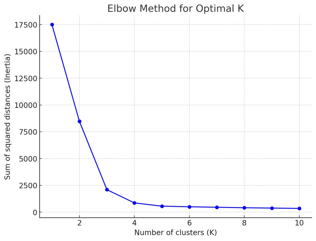
- Purpose: Helps determine the optimal number of clusters by plotting the sum of squared distances from each point to its assigned cluster center for various values of ‘K’.
- What to look for: The “elbow” in the curve where adding more clusters leads to diminishing returns in reducing distances.
- Axes:
- X-axis: Number of clusters (K)
- Y-axis: Sum of squared distances (inertia)
Silhouette Score Plot
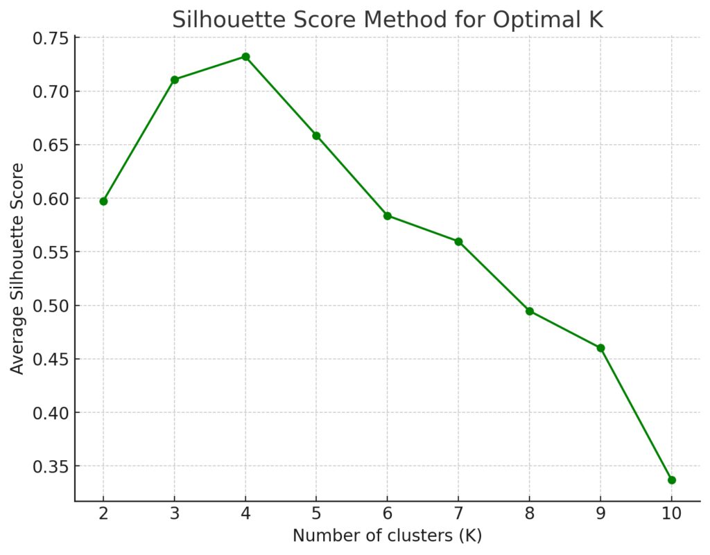
- Purpose: Measures how similar points are to their own cluster vs other clusters. It helps assess the quality of your clustering.
- What to look for: The highest silhouette score indicates the best number of clusters.
- Axes:
- X-axis: Number of clusters (K)
- Y-axis: Average silhouette score
Cluster Visualization Using PCA
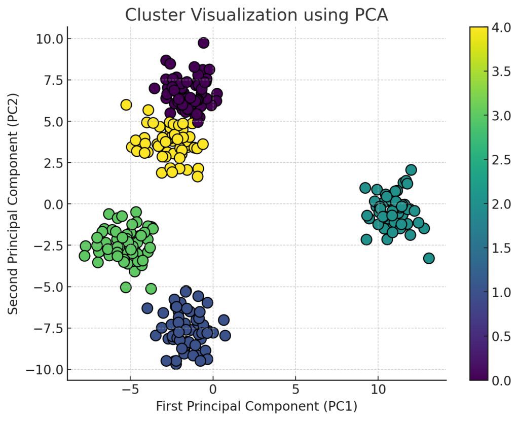
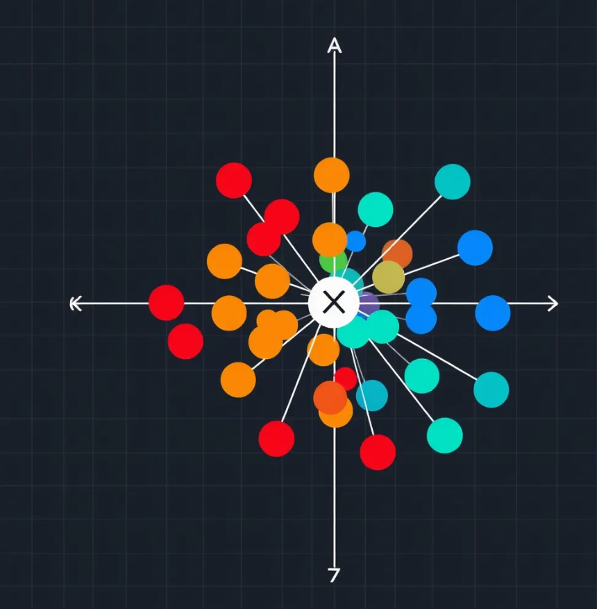
- Purpose: Visualizes data clusters in 2D using Principal Component Analysis (PCA) for dimensionality reduction. This helps you see how distinct your clusters are.
- What to look for: Clear separation between clusters means a good value of ‘K’. Overlapping or poorly defined clusters indicate a need for fewer/more clusters.
- Axes:
- X-axis: First Principal Component (PC1)
- Y-axis: Second Principal Component (PC2)
Dendrogram (For Hierarchical Clustering with K-Means)
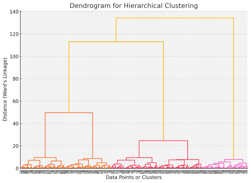
- Purpose: Shows the hierarchy of clusters, useful for determining the number of clusters before applying K-Means.
- What to look for: The height of the branches (distance between clusters). Cut the dendrogram at a height where natural divisions occur.
- Axes:
- X-axis: Data points or clusters
- Y-axis: Distance or similarity between clusters
Gap Statistic Plot
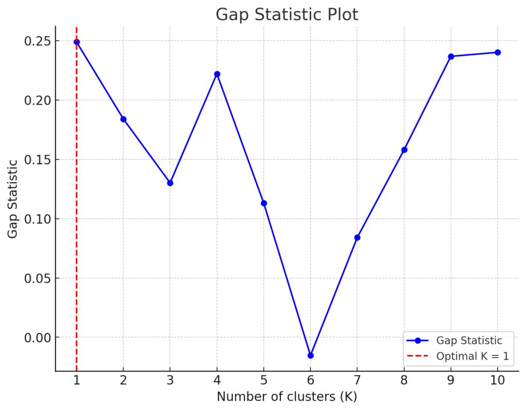
- Purpose: Compares within-cluster dispersion with that of random data to identify the optimal number of clusters.
- What to look for: The largest gap between the log of within-cluster dispersion of your data and that of the random data represents the best value for ‘K’.
- Axes:
- X-axis: Number of clusters (K)
- Y-axis: Gap statistic
FAQs
What happens if I choose too few or too many clusters?
If you choose too few clusters, you risk oversimplifying your data, lumping together data points that are actually quite different. If you choose too many clusters, you overcomplicate the model, breaking apart natural groupings and finding distinctions that don’t really exist. Both scenarios lead to misleading insights.
What is the easiest method to determine the optimal number of clusters?
The Elbow Method is one of the simplest and most commonly used methods. It involves plotting the sum of squared distances from each data point to its assigned cluster center for different values of ‘K’ and identifying the point where the curve starts to flatten (like an elbow).
Can I use cross-validation to select ‘K’?
Not traditionally. K-Means clustering isn’t a supervised model, so typical cross-validation doesn’t apply. However, some variations of cross-validation for unsupervised learning exist, but they’re not as straightforward and may not offer a clear-cut solution.
Is there a one-size-fits-all number of clusters?
No, the optimal number of clusters depends on your specific dataset and the problem you’re trying to solve. The best approach is to combine multiple methods (like the Silhouette Score or Gap Statistic) to ensure you choose the most appropriate ‘K’ for your data.
Can I use domain knowledge to select the number of clusters?
Absolutely! In fact, domain knowledge is crucial in many cases. Understanding the nature of the data—whether it’s customer segments, disease classifications, or product categories—can help guide your decision on how many clusters make sense.
What is the Gap Statistic and when should I use it?
The Gap Statistic compares the clustering results of your data with those of a random dataset. The best number of clusters is the one where this gap is largest, indicating that your clusters are meaningful and not just random noise. It’s particularly useful when you’re unsure of how many clusters might naturally exist in the data.
What tools can I use to automate ‘K’ selection?
There are plenty of Python libraries like scikit-learn for basic clustering techniques, and more advanced packages like Yellowbrick that can visualize different metrics (such as the Elbow Method or Silhouette Score). Additionally, the GAP-statistic package in R and Python can automate gap statistic calculations.
How do I visualize clusters in my data?
You can use dimensionality reduction techniques like PCA (Principal Component Analysis) or t-SNE (t-distributed Stochastic Neighbor Embedding) to reduce your dataset to 2 or 3 dimensions for visualization. Plotting these reduced dimensions can help you see natural groupings in your data.
What is the Silhouette Score, and how does it help?
The Silhouette Score measures how similar a data point is to its own cluster compared to others. Scores range from -1 to 1, where higher values mean better-defined clusters. A higher Silhouette Score suggests a better fit for the chosen number of clusters.
How do I avoid overfitting with K-Means?
To avoid overfitting, limit the number of clusters. More clusters create increasingly specific groupings, but that doesn’t always mean better. Use methods like the Elbow Method and Gap Statistic to determine when adding more clusters no longer provides significant benefits.
Can I use K-Means with non-numerical data?
K-Means clustering works best with numerical data because it relies on calculating distances between points (like Euclidean distance). However, you can still apply K-Means to non-numerical data by converting categorical variables into numerical formats, like using one-hot encoding or using specialized methods like K-modes clustering for categorical data.
What are some common alternatives to K-Means for clustering?
Some popular alternatives to K-Means include:
- Hierarchical clustering, which doesn’t require a predefined number of clusters.
- DBSCAN (Density-Based Spatial Clustering of Applications with Noise), which is great for finding clusters of varying shapes and sizes and dealing with noise.
- Gaussian Mixture Models (GMMs), which assume that data points are generated from a mixture of several Gaussian distributions.
These methods can sometimes work better than K-Means when dealing with complex data structures.
How does the initial placement of centroids affect K-Means?
The initial placement of centroids (the center of each cluster) can heavily impact the final clustering result. Poor initial placement may lead to suboptimal clustering or cause the algorithm to converge slowly. To address this, the K-Means++ initialization method is often used to improve the starting positions of centroids, which leads to faster convergence and better clusters.
Is K-Means clustering sensitive to outliers?
Yes, K-Means is quite sensitive to outliers. Since the algorithm tries to minimize the distance between points and their cluster centers, an outlier can distort the centroid location and affect the clustering results. If your dataset contains significant outliers, you might want to use a method like DBSCAN, which is more robust to outliers, or apply preprocessing steps to remove or handle outliers.
Can K-Means handle large datasets?
Yes, K-Means is efficient and can handle large datasets because its computational complexity is linear concerning the number of data points. However, for extremely large datasets, running K-Means might still be time-consuming. In such cases, you can use optimized versions like MiniBatch K-Means, which processes smaller random samples of the dataset for faster computation without sacrificing too much accuracy.
What should I do if my data has different scales?
If your features have vastly different scales (e.g., height in centimeters and income in dollars), the distance calculations in K-Means can become skewed. To avoid this, you should standardize your data using methods like z-score normalization or min-max scaling so that all features contribute equally to the clustering process.
How do I know if my clusters are meaningful?
Evaluating the meaningfulness of your clusters often requires a combination of quantitative metrics and domain expertise. Methods like the Silhouette Score, inertia, or the Gap Statistic can help you quantitatively assess the quality of clusters. But it’s also important to interpret the results in the context of your specific domain—do the clusters align with your understanding of the data? Are they actionable?
Can I cluster time-series data with K-Means?
Yes, you can cluster time-series data using K-Means, but you’ll likely need to transform the data first. One approach is to use feature extraction to summarize the time-series into key metrics (such as average, variance, or specific frequency components) before applying K-Means. Alternatively, techniques like Dynamic Time Warping (DTW) can be used in conjunction with K-Means to handle the time-series’ temporal dynamics directly.
Resources
Here are some helpful resources for learning more about K-Means clustering and how to determine the optimal number of clusters:
Resources for Understanding K-Means Clustering
1. Scikit-learn Documentation: K-Means
The official documentation for scikit-learn provides a clear and concise explanation of how K-Means works and how to implement it in Python. It also includes examples with code and visualizations for better understanding.
2. “Introduction to Data Mining” by Pang-Ning Tan, Michael Steinbach, and Vipin Kumar
This textbook provides a thorough introduction to clustering techniques, including K-Means. It covers not only the algorithm but also practical considerations for its implementation and evaluation.
- Available on Amazon or university libraries.
3. “Pattern Recognition and Machine Learning” by Christopher Bishop
This book offers a deeper, more mathematical dive into clustering algorithms like K-Means, providing theoretical explanations of how the algorithm functions, along with other methods such as Gaussian Mixture Models (GMMs).
- Available in most technical book retailers or university resources.
4. Python Data Science Handbook by Jake VanderPlas
This is a comprehensive resource for learning about data science in Python, including clustering algorithms like K-Means. It covers essential Python libraries (like scikit-learn) and practical code examples.
5. Online Course: “Unsupervised Learning in Python” by DataCamp
This online course includes hands-on tutorials for applying unsupervised learning techniques, including K-Means clustering. It focuses on practical implementation and interpreting results.
6. “Clustering in Machine Learning” by Towards Data Science
This comprehensive blog article introduces various clustering techniques, including K-Means, and explains how to choose the optimal number of clusters using different methods such as the Elbow Method and Silhouette Score.
7. GAP Statistic Tutorial in R and Python
If you’re interested in using the Gap Statistic to determine the optimal number of clusters, this tutorial explains how to compute it in both R and Python. It offers code examples and guides on interpreting the results.
8. “The Elements of Statistical Learning” by Trevor Hastie, Robert Tibshirani, and Jerome Friedman
This textbook is a classic in the field of machine learning and covers a wide range of topics, including clustering and how to evaluate unsupervised learning algorithms.
- Available for free here.
9. YouTube: “K-Means Clustering Algorithm” by StatQuest with Josh Starmer
A series of easy-to-understand videos explaining how K-Means clustering works, what the “K” means, and methods for determining the optimal number of clusters.
10. Yellowbrick: Visualizing K Selection
The Yellowbrick library in Python provides visualizations for machine learning, including an easy-to-use method for determining the optimal number of clusters using the Elbow Method and Silhouette Score.
These resources offer a mix of practical guides, theoretical insights, and tutorials to help you better understand and implement K-Means clustering while choosing the best number of clusters for your data.