
Unlocking the Secrets of Complex Data
Ever feel like you’re drowning in data? High-dimensional datasets are everywhere, and they can be overwhelming to understand.
That’s where t-SNE comes in. Offering a lifeline for anyone trying to make sense of the seemingly incomprehensible. This algorithm takes massive amounts of information and simplifies it into something you can actually see—revealing hidden patterns that were once locked away in a tangle of dimensions.
Curious to dive deeper into how it works and why it’s so powerful? Let’s break it down.
What Exactly is t-SNE?
t-SNE, or t-Distributed Stochastic Neighbor Embedding, is a machine learning algorithm used for dimensionality reduction. It takes large, complex datasets (usually with many dimensions) and reduces them into two or three dimensions, which are easy to visualize. Think of it like a magician simplifying a complicated card trick so that you can finally understand the sleight of hand.
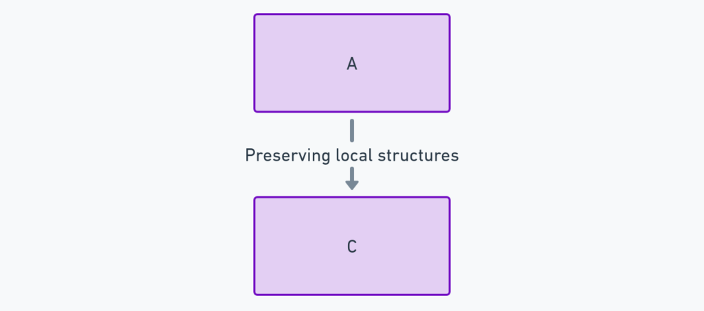
Unlike traditional methods such as PCA (Principal Component Analysis), t-SNE focuses on preserving local structures in data. That means if two data points are close in the high-dimensional space, they’ll be close in the lower-dimensional representation too. It’s like creating a map that keeps the most important roads intact!
Why Do We Need t-SNE?
If you’ve ever worked with high-dimensional data, you know the struggle. You’re staring at rows upon rows of numbers, wondering where the meaningful patterns are hidden. The human brain is fantastic at recognizing patterns, but only in a few dimensions—two or three at most.
When you increase that to 20 or 100 dimensions, it’s nearly impossible for the naked eye to make sense of the relationships.

That’s where t-SNE steps in. By reducing the data into a manageable number of dimensions while maintaining structural integrity, it allows you to see clusters, outliers, and patterns that would be invisible otherwise. Whether you’re dealing with text embeddings, gene expression data, or image classification results, t-SNE can give you a much clearer picture.
How Does t-SNE Work?
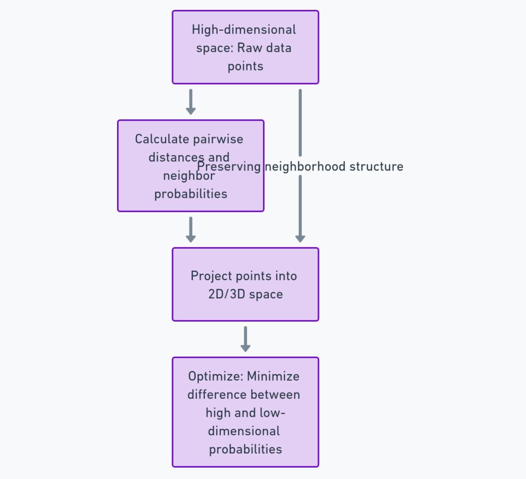
At its core, t-SNE tries to balance two things: keeping similar points close together and keeping dissimilar points far apart. It does this by calculating the probability that two points are neighbors in both the original high-dimensional space and the reduced space. t-SNE then adjusts the positions in the reduced space until these probabilities match as closely as possible.
There’s a clever trick here: t-SNE uses a technique called Stochastic Neighbor Embedding, where instead of hard-cut distances, it calculates probabilities. This allows the algorithm to focus more on preserving small neighborhoods rather than large global structures, making it perfect for data that has clusters or groups.
Tuning t-SNE: Perplexity and Learning Rate
t-SNE isn’t a plug-and-play algorithm—you need to tune it to get the best results. Two of the key hyperparameters you’ll need to tweak are perplexity and learning rate.
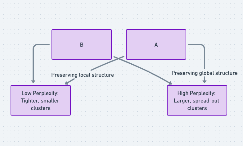
Perplexity is a measure of how well t-SNE captures the local density of data points. A lower perplexity means the algorithm focuses on very small, dense clusters, while a higher value leads to a broader focus on larger structures. The right value depends on your data and goals, but typical values range between 5 and 50.
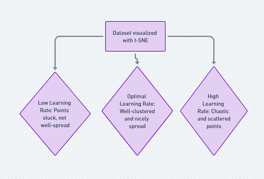
Meanwhile, the learning rate controls how much the positions of points change in each iteration of the optimization process. If it’s too high, you risk overshooting and getting a messy plot. If it’s too low, the algorithm could get stuck and take too long to converge.
Pros of Using t-SNE in Data Science
The beauty of t-SNE lies in its ability to capture non-linear structures that other dimensionality reduction techniques may miss. For example, it’s excellent for visualizing clusters that represent different classes in your data, such as different handwritten digits in the popular MNIST dataset. With t-SNE, you get an insightful, often stunning view of your data’s underlying patterns—something that can guide further analysis or decision-making.
Challenges of t-SNE: It’s Not Always Smooth Sailing
While t-SNE is a powerful tool, it isn’t without its limitations. One of the main issues is that it can be computationally expensive. The algorithm doesn’t scale well to very large datasets, meaning if you’re working with millions of data points, it could take an impractical amount of time to run.
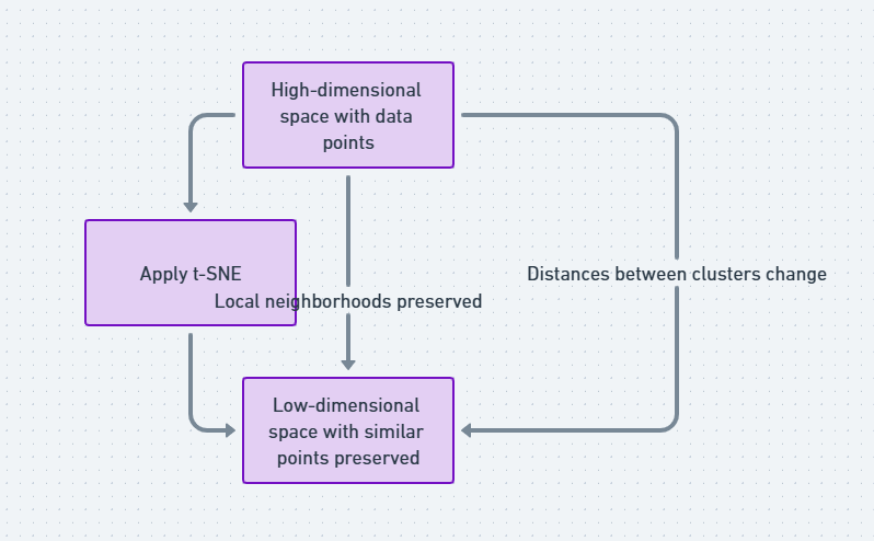
Additionally, t-SNE visualizations can sometimes be tricky to interpret. The way the algorithm compresses distances can lead to plots where the distance between clusters is not always meaningful. You might see clear separation between groups, but those gaps don’t necessarily represent the true relationship in the original high-dimensional space. This is important to remember, as interpreting distances between clusters can mislead your analysis if you’re not careful.
Moreover, random initialization means that t-SNE results can vary from run to run. Each time you apply the algorithm, it may produce slightly different visualizations because it starts with random positions for your data points. This isn’t usually a dealbreaker, but it does mean you should run t-SNE multiple times to ensure consistent insights.

Comparing t-SNE with Other Dimensionality Reduction Methods
You might be wondering how t-SNE stacks up against other techniques like PCA (Principal Component Analysis) or UMAP (Uniform Manifold Approximation and Projection). While t-SNE is highly effective at visualizing local relationships and clusters, it differs from PCA in that it doesn’t attempt to preserve large-scale global structure. PCA, on the other hand, captures linear relationships in the data and is much faster to compute, but it may miss non-linear patterns.
Then there’s UMAP, a newer algorithm that is considered a competitor to t-SNE. UMAP has the advantage of being faster and often producing more meaningful global structures, while still capturing local relationships. The choice between these tools depends largely on your dataset and what you hope to achieve with your visualization.
Common Use Cases: Where t-SNE Shines
One of the most popular applications of t-SNE is in natural language processing (NLP). It’s often used to visualize word embeddings—high-dimensional vectors that represent the meaning of words based on their context. With t-SNE, you can easily see how similar words cluster together, revealing interesting linguistic patterns. For instance, words like “king” and “queen” might appear near each other in a t-SNE plot, as their embeddings are similar.
Another key use case is in genomics. Researchers often deal with massive datasets that record gene expressions across thousands of samples. t-SNE helps reduce this complex data into something more understandable, showing which genes are similarly expressed and potentially helping to uncover biological insights.
Lastly, image processing is another field where t-SNE is widely used. When you apply t-SNE to high-dimensional image data, it can reveal patterns of similarity between different images, often helping in tasks like classification or clustering.
Pitfalls to Avoid When Using t-SNE
While t-SNE is incredibly useful, there are some common mistakes that can lead to poor results. One of the most frequent pitfalls is overinterpreting the visualization. Just because two clusters are far apart in a t-SNE plot doesn’t necessarily mean they’re that different in the high-dimensional space. t-SNE focuses on local neighborhoods and can distort global relationships, so be cautious about reading too much into the distances between clusters.
Another issue is using t-SNE without enough preprocessing. Since t-SNE is sensitive to noise and outliers, it’s essential to clean and normalize your data before applying the algorithm. Failing to do so could result in a messy, unclear visualization that doesn’t provide any real insight.
Lastly, if you’re working with extremely large datasets, you might want to consider subsampling before running t-SNE. Running the algorithm on millions of points isn’t just slow—it’s also likely to produce a confusing plot. By taking a representative subset of your data, you can get clearer, more informative visualizations.
Interpreting t-SNE Results: What to Look For
When you run t-SNE and get that beautiful, colorful plot, it’s tempting to immediately start drawing conclusions. But before you do, there are a few key things to keep in mind.
First, focus on the clustering. Are there clear groups of points that seem to naturally fall together? These clusters might represent categories or classes within your data that you didn’t even know existed. On the other hand, if your data doesn’t show any clear clusters, that might suggest it’s more homogeneous than you thought.
Next, watch out for outliers. t-SNE is great at highlighting points that don’t belong in any cluster—these outliers can be a signal that something interesting is happening in your data, or they might simply represent noise that you need to clean up.
Finally, remember that t-SNE is a tool for exploration rather than definitive answers. The insights you gain from a t-SNE plot should guide further investigation, not serve as the final word on your data.
Best Practices for Running t-SNE Efficiently
Running t-SNE efficiently is key to avoiding unnecessary bottlenecks. Since the algorithm can be slow on large datasets, there are a few strategies to speed things up without sacrificing too much detail. First, you can reduce the number of features beforehand by applying a technique like PCA to cut down on dimensions. This way, t-SNE has fewer variables to work with, resulting in faster computations.
Another helpful tip is to subsample your data. t-SNE often works well with a representative sample of your dataset rather than the entire thing. If your data has millions of points, selecting a few thousand representative ones can provide nearly the same insights while drastically cutting down on processing time.
Using GPU acceleration is another powerful option. Some implementations of t-SNE, such as those in TensorFlow, offer GPU support, allowing for much faster performance than traditional CPU-only approaches. If you’re working with large datasets regularly, taking advantage of a GPU can make a world of difference.
Interpreting Clusters: How to Make Sense of Your t-SNE Plot
Once you’ve generated a t-SNE plot, the next step is interpreting the clusters you see. But what exactly do these clusters represent? In most cases, the clusters signify similar data points that share common features. For example, in a t-SNE plot of image data, each cluster might represent images of the same object, such as different views of a dog or cat.
But keep in mind that t-SNE’s focus is local—it aims to keep close points together, but the distances between different clusters might not be as meaningful. Instead of focusing on the absolute distance between clusters, pay attention to the density of points within clusters. Tight clusters with little overlap may indicate distinct classes or groups, while more spread-out clusters could suggest overlapping or ambiguous categories.
Also, examine whether the clusters are aligned with your expectations. If you’ve labeled data, do the clusters match known categories? If not, you may have uncovered something new—an opportunity to delve deeper into why certain points are grouping together in unexpected ways.
t-SNE and Noise: Handling Messy Datasets
Real-world data is rarely clean, and noise can interfere with your t-SNE results. Noisy data can lead to messy plots where points that should belong to the same cluster get scattered across different parts of the visualization. To mitigate this, it’s crucial to clean your data as much as possible before running t-SNE.
Standard preprocessing steps like scaling and normalization are essential when using t-SNE. Ensuring that all your features are on the same scale can help the algorithm better capture the true relationships between data points. Additionally, removing outliers—data points that are extreme or don’t belong—can improve the clarity of your t-SNE plot by ensuring the algorithm focuses on the important patterns.
Another way to reduce noise in your t-SNE results is by adjusting the perplexity setting. Lower perplexity values force t-SNE to focus more on small, tight clusters, which can help in identifying core structures in a noisy dataset.
Limitations of t-SNE: What It Can and Can’t Do
While t-SNE is undoubtedly powerful, it’s not without limitations. One of the biggest challenges is its tendency to distort global relationships in the data. While it preserves local neighborhood structures, t-SNE does not accurately reflect the overall distances between widely separated clusters. This means that while you can trust the grouping of nearby points, you shouldn’t rely too heavily on the distances between different groups.
Another limitation is that t-SNE is primarily a visualization tool. It doesn’t provide a direct way to classify or predict based on the clusters it uncovers. Instead, you’ll need to use it in conjunction with other methods to draw actionable conclusions from your data.
Finally, t-SNE’s results can be hard to reproduce. Since it uses random initialization, running t-SNE multiple times on the same dataset can produce slightly different visualizations. To address this, you can set a random seed before running the algorithm, ensuring that your results are consistent across different runs.
Exploring Alternatives: When t-SNE Isn’t the Right Fit
t-SNE isn’t always the best option for every dataset. If you’re working with extremely large datasets or need faster performance, you might want to consider alternatives like UMAP. UMAP tends to be faster than t-SNE and can often produce more meaningful global structures while still preserving local neighborhoods. It’s gaining popularity in fields like genomics and image processing, where data size and complexity are significant concerns.
Another alternative is PCA, which, while less powerful at capturing non-linear relationships, is excellent for visualizing simpler datasets and has the advantage of being much faster. If your data has a linear structure, PCA might be all you need to extract meaningful insights.
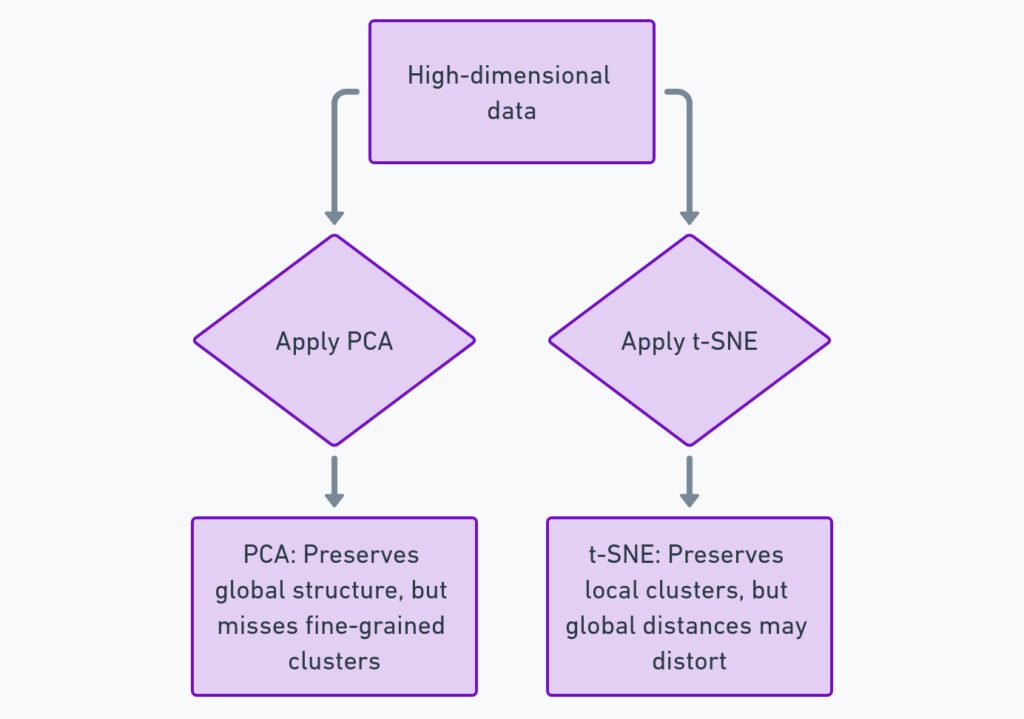
Ultimately, the choice between t-SNE, UMAP, PCA, or other dimensionality reduction techniques comes down to the specifics of your data and your goals. For purely exploratory analysis or creating beautiful visualizations, t-SNE is often the go-to choice. But for tasks that require faster computation or clearer interpretation of global structures, other methods might be better suited.
Real-World Examples of t-SNE in Action
To see t-SNE’s power in action, let’s explore a few real-world examples where it has made a significant impact. One well-known use of t-SNE is in the analysis of handwritten digit data, specifically the MNIST dataset. This dataset consists of thousands of images of handwritten numbers, and using t-SNE to reduce the dimensionality reveals distinct clusters for each digit, showing how well the algorithm can separate similar-looking but subtly different patterns.
Another striking example is in biological data analysis. In genomics, researchers frequently work with data on gene expression across different tissues or conditions. This type of data can have thousands of dimensions, making it difficult to interpret. With t-SNE, researchers have been able to reduce the dimensionality of these datasets and identify distinct groups of genes that are similarly expressed, often pointing to shared biological functions or disease markers.
In the field of natural language processing, t-SNE is used to visualize word embeddings—high-dimensional representations of words that capture their meaning based on context. Applying t-SNE to these embeddings often produces fascinating results, with similar words clustering together in the reduced space. For example, in a t-SNE plot of word vectors, you might see “man” and “woman” in one cluster, while “king” and “queen” form another, demonstrating how t-SNE helps reveal semantic relationships between words.
Practical Tips for Using t-SNE
If you’re ready to dive into using t-SNE on your own datasets, here are some practical tips to get you started. First, always remember to normalize your data. t-SNE is sensitive to differences in scale, so ensuring that your features are on a common scale can make a big difference in the quality of the visualization.
Next, experiment with different values for the perplexity parameter. Perplexity controls the balance between local and global data structure, and while there are common default values (like 30), the optimal value can vary depending on your dataset. Try running t-SNE with different perplexity settings to see how it affects the clustering.
Another tip is to be mindful of the size of your dataset. t-SNE doesn’t perform well on extremely large datasets, so if you’re working with a big dataset, consider subsampling to reduce the number of data points. This allows t-SNE to run faster without losing the general trends and patterns you’re trying to uncover.
Finally, consider running t-SNE multiple times, especially if your results seem inconsistent. Since t-SNE’s random initialization can lead to slightly different results on each run, it’s often a good idea to rerun the algorithm and compare the outputs, ensuring that the key patterns hold across different iterations.
The Future of t-SNE and Data Visualization
t-SNE has already transformed the way we visualize high-dimensional data, but what does the future hold for this powerful tool? As more researchers and data scientists look for ways to tackle ever-larger datasets, the demand for faster, more scalable alternatives to t-SNE will continue to grow. Tools like UMAP are already offering faster, more robust options for visualizing large, complex datasets, and we can expect further developments in this area as the field evolves.
That said, t-SNE will likely remain a go-to tool for certain use cases, especially when it comes to exploring local data structures and producing visually stunning representations of complex data. With improvements in hardware, such as faster GPUs, and optimizations to the algorithm itself, t-SNE’s limitations may become less of a barrier over time.
As we continue to develop new ways of analyzing and interpreting data, t-SNE will remain a cornerstone of modern data science, offering invaluable insights into the hidden patterns and relationships that shape our understanding of the world around us.
FAQ: Understanding t-SNE for Visualizing High-Dimensional Data
1. What is t-SNE?
t-SNE (t-Distributed Stochastic Neighbor Embedding) is a machine learning algorithm used for dimensionality reduction and data visualization. It takes high-dimensional data and reduces it to two or three dimensions, making it easier to visualize complex patterns and structures in the data.
2. How does t-SNE work?
t-SNE works by calculating the probability that two points are neighbors in both the high-dimensional space and the reduced, low-dimensional space. It then adjusts the points in the lower dimension to match these probabilities as closely as possible, preserving local relationships between data points. This means that data points that are close together in the original space remain close in the reduced space, forming clusters that represent similar data.
3. What are the key advantages of using t-SNE?
t-SNE excels at:
- Visualizing clusters of similar data points.
- Revealing non-linear relationships that traditional methods like PCA might miss.
- Creating intuitive visual representations of complex, high-dimensional data.
It is particularly useful in fields like natural language processing, genomics, and image classification, where understanding local data patterns is crucial.
4. What are the limitations of t-SNE?
t-SNE has some limitations:
- Computationally expensive: It can be slow, especially with large datasets.
- Global structure distortion: While t-SNE preserves local neighborhoods, it can distort the global structure of the data, meaning the distance between clusters in the plot may not reflect real-world differences.
- Non-reproducibility: Each time you run t-SNE, the result might be different due to random initialization unless you set a fixed seed.
5. What is perplexity in t-SNE, and how do I set it?
Perplexity is a key hyperparameter in t-SNE that controls the balance between focusing on local and global structures. It defines the number of close neighbors each point considers when reducing dimensions. Typical values for perplexity range between 5 and 50, but the optimal value depends on the size and nature of your dataset. Larger perplexity values work better for bigger datasets, while smaller values are more effective for smaller, denser data.
6. How is t-SNE different from PCA (Principal Component Analysis)?
While both are dimensionality reduction techniques, PCA captures linear relationships and is faster but might miss more complex, non-linear structures. t-SNE, on the other hand, preserves local relationships and excels at identifying non-linear patterns, making it more effective for visualizing clusters but less useful for understanding large-scale global structure.
7. Can t-SNE be used for large datasets?
t-SNE doesn’t scale well with large datasets because of its computational complexity. For very large datasets (thousands to millions of points), it’s common to subsample the data or use alternatives like UMAP (Uniform Manifold Approximation and Projection), which offers similar results but with faster performance.
8. How do I handle noise when using t-SNE?
Preprocessing your data is essential when using t-SNE. This includes scaling, normalizing, and removing outliers to reduce noise. Noise in the data can lead to cluttered, unclear visualizations, making it harder to identify meaningful patterns. Proper data cleaning and choosing the right hyperparameters (like perplexity) can improve results significantly.
9. How do I interpret a t-SNE plot?
In a t-SNE plot:
- Clusters represent groups of similar data points.
- Tight clusters often indicate well-defined categories or classes.
- Overlapping clusters may suggest ambiguity or shared characteristics between groups.
However, remember that the distance between clusters doesn’t always carry meaning. t-SNE focuses on local relationships, so global distances might be distorted.
10. How can I reproduce the same t-SNE results?
Since t-SNE uses random initialization, results can vary each time it is run. To reproduce results consistently, you can set a random seed before running the algorithm. Many t-SNE implementations allow you to do this by specifying the seed when you run the function.
11. What are some alternatives to t-SNE?
If t-SNE isn’t a perfect fit, consider:
- PCA: For faster dimensionality reduction, especially with linear data.
- UMAP: A newer algorithm that is faster than t-SNE and often better at preserving global structure while maintaining local clusters.
- LLE (Locally Linear Embedding): Another method focused on preserving local relationships in data but less popular than t-SNE.
12. How can I use t-SNE in a machine learning pipeline?
t-SNE can be used in exploratory data analysis to visualize high-dimensional data before applying machine learning models. It helps identify clusters or patterns that inform further analysis. After running t-SNE, you might apply clustering algorithms like k-means on the reduced data to classify or group data points.
13. Can I combine t-SNE with other dimensionality reduction techniques?
Yes! A common approach is to first apply PCA to reduce the dimensionality of the dataset to a manageable level (e.g., 50 dimensions), and then apply t-SNE for further reduction and visualization. This two-step process can improve t-SNE’s efficiency and clarity, especially with noisy or large datasets.
14. Is t-SNE suitable for unsupervised learning?
Yes, t-SNE is widely used in unsupervised learning tasks where the goal is to uncover hidden structures in unlabeled data. It helps in visualizing and identifying clusters in the data, which can then inform the use of clustering algorithms or further analysis.
Top Resources for Learning and Mastering t-SNE
1. Official Documentation and Tutorials
- Scikit-learn Documentation:
Scikit-learn provides an excellent implementation of t-SNE with a detailed explanation of the algorithm, usage examples, and hyperparameter settings.
Link: Scikit-learn t-SNE - TensorFlow t-SNE Tutorial:
TensorFlow also offers t-SNE support and provides GPU acceleration for faster computation. Their tutorial walks through applying t-SNE for high-dimensional data visualization.
Link: TensorFlow t-SNE
2. Research Papers and Theoretical Background
- Original t-SNE Paper by Laurens van der Maaten and Geoffrey Hinton:
This foundational paper introduces the t-SNE algorithm, discussing its mathematical foundation and applications in various fields. - Visualizing Data Using t-SNE:
This paper explores the intuition behind the algorithm and includes practical examples of how t-SNE can reveal insights from high-dimensional data.
Link: ResearchGate
3. Online Courses and Tutorials
- Coursera – Applied Machine Learning: Dimensionality Reduction:
This course covers a variety of dimensionality reduction techniques, including t-SNE, PCA, and UMAP, focusing on practical implementations.
Link: Coursera Applied Machine Learning - Kaggle Notebooks:
Kaggle offers interactive t-SNE notebooks where you can practice coding and visualize t-SNE outputs on real datasets.
4. Blog Posts and Tutorials
- Distill.pub – Visualizing MNIST:
This interactive blog post explains how t-SNE can be applied to visualize the MNIST dataset (handwritten digits), offering visual step-by-step insights into how the algorithm works.
Link: Distill.pub MNIST - Towards Data Science – A Visual Guide to t-SNE:
This beginner-friendly tutorial explains the core principles behind t-SNE using intuitive visuals and step-by-step examples.
5. Open-Source Libraries and Tools
- Scikit-learn:
A popular machine learning library in Python that includes an easy-to-use implementation of t-SNE.
Link: Scikit-learn GitHub - TensorFlow:
TensorFlow offers a t-SNE implementation optimized for large datasets and supports GPU acceleration.
Link: TensorFlow GitHub - t-SNE-CUDA:
A GPU-accelerated version of t-SNE for those working with very large datasets, significantly improving computation speed.
Link: t-SNE CUDA GitHub
6. Visual and Interactive Tools
- Projector by TensorFlow:
A powerful interactive tool for visualizing high-dimensional data using t-SNE and other dimensionality reduction algorithms like PCA and UMAP. Great for hands-on experimentation with word embeddings and other data. - OpenAI’s Embedding Projector:
An easy-to-use interface for exploring and visualizing embeddings using t-SNE. Perfect for getting started with your own datasets.
Link: OpenAI Embedding Projector
7. Books for In-Depth Learning
- “Hands-On Machine Learning with Scikit-Learn, Keras, and TensorFlow” by Aurélien Géron:
This book offers comprehensive examples of t-SNE and other dimensionality reduction techniques, with a focus on practical implementations using popular Python libraries. - “Python Data Science Handbook” by Jake VanderPlas:
A fantastic resource for learning data science and machine learning in Python, with examples of t-SNE implementations and visualizations.
8. GitHub Repositories with t-SNE Projects
- t-SNE by Laurens van der Maaten (Original):
The original t-SNE codebase written by the algorithm’s creator, providing an excellent reference point for understanding how t-SNE is implemented.
Link: t-SNE GitHub - Kaggle Datasets and Kernels:
Kaggle is a great platform to find real-world datasets and explore t-SNE implementations on data such as MNIST, CIFAR-10, and more.
Link: Kaggle